Inspiration

Friday Five

For today's "Friday Five" I wanted to share 5 instagram accounts that I've been finding some eye candy/inspiration in lately.  

Juniper Studio- If you've been a long-time design blog follower, you probably know Jenny from Little Green Notebook and Jenny's Print Shop, so it should be no surprise that her design studio is one I love to watch!


Moss and Blue- Julianne is an awesome local artist (and soon to be mamma) who's work I have loved for a while!  She's currently working on a custom painting for one of my clients and I can't wait to see it in the room when everything is all pulled together!!  The custom work in progress is the one on the easel.  Can you tell why I'm so excited?!?


Texture Florals-  The name says it all.  Every arrangement looks like it should be a still life oil painting.


New England Loom- Well, because a good vintage rug makes me weak at the knees and these guys have me pegged.  I'll take them all, please and thank you!


Studio McGee-  Living under a rock?  That might be the only way you aren't familiar with Studio McGee these days (And if you aren't, theres about a 97.9999% chance you've seen one of their spaces without realizing it).  I mean they only have 718 THOUSAND instagram followers.  Small potatoes.  Shea McGee seems to have layering textures down to a precise science.


Crash! Calliope Paperie

First of all, it's been a while since posting a "Crash!" so let me briefly explain/refresh your memory.  I invite myself and camera into a home or local store that I love and share with you!  So without further ado, I bring you, Calliope Paperie!  


This installment of "Crash!" has a double meaning.  Just a few short months ago,  Calliope Paperie looked like this, a very literal crash:


Photo via Calliope Paperie


After less than a year open, in a senseless road rage accident, Calliope's front window and front half of her store were completely smashed.  Luckily, everyone was ok, but the store took several months to rebuild.


I'm lucky that this awesome store is right around the corner from my house and has quickly become the place to get cards.  The owner, Kristina, somehow is able to find the most amazing, quirky, and often local cards.  Not just a card shop though, Calliope also carries, planners, notebooks, an impressive collection of pens, pencil cases, and gifts from local makers like candles and jewelry.  In addition to allowing me to share her shop with you, Kristina also answered a few questions :


Calliope started with your online shop, Crumple & toss- when did you first open online?  And what about Calliope's brick and mortar store?

Online store opened in June of 2014.  After a one-week pop-up shop in Cambridge went over like gangbusters in November of 2015, I found a great spot in Natick the following Spring! I opened Calliope in June of 2016!


What inspired you to start your own business?

A love of cards and paper literally my entire life is what inspired Calliope. At first I thought I might want to have a scrapbooking/paper crafting type store but the more I thought about it, it was really cards and letter-writing that had my full attention. There is still a huge love for stationery across all ages. People think paper and writing is dying but it 100% is NOT.


How would you describe your store?

Calliope is a place for people who LOVE paper. I love when people come in and say "But do you have any gifts?" ha! YES!! EVERYTHING is a gift for someone who loves stationery like I do.


What is your favorite thing about your store?

My favorite thing is my card wall. Is that cheating? There's nothing I love more than shopping for cards and curating my card wall.


Thanks, Kristina for letting me and my tiny sidekick come by and photograph your shop!  I love having a place like this so close by!  If you aren't in the Natick area, you can still shop all the awesomeness at Calliope Paperie's online store!


Would you like to see your home featured on Crash!?  Is there a local shop you think would be perfect to share?  I'd love to hear about it!  E-mail me your ideas @ blog@copperdotinteriors.com


Save

Save

Save

Save

Save

Save

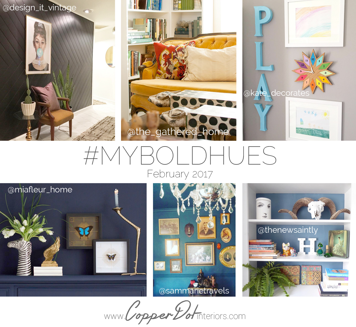
My Bold Hues

Somehow, I blinked and it already the end of February and time for another round up of #MyBoldHues posts!  #MyBoldHues on instagram is a way to show off and celebrate your lives filled with color.  

It's the last Wednesday of the month!  Meaning myself and the other co-hosts will be sharing our favorite #MyBoldHues instagrams on our blogs, whether it be spaces, projects or moments that are full of color!  Admittedly, I haven't spent much time on instagram this month- my life juggling skills are being put to the test now that I'm finding myself only 2 months (!!!!) from Copper Dot Baby's arrival (and trying to finish a flip... cue panic attack).  You can imagine my pleasant surprise when I popped on instagram yesterday to poke through all the amazing posts that have been tagged this month!!  You guys are awesome!


****As per usual, please practice responsible pinning.  The below images are NOT my own and shouldn’t be pinned from my page.  Please click through to the original source to pin inspiration****


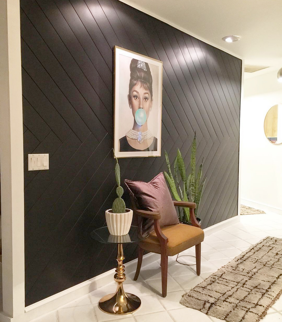
Does it get much more bold than a black planked wall?  I love the detail of the interlocking shiplap on Nicole @design_it_vintage's  wall, but the color totally makes it!


Brynne @the_gathered_home has such an eye for thrift shopping.  Every time I see her yellow velvet living room sofa, I fall a little harder.  And p.s. guys, that corner bookcase behind? IKEA.  Awesome, right?


This pic may not seem quite as bold as the others, however it's not about how bright your colors are, it's about how well you use them!  2 things had me at "hello" with @kate_decorates'  playroom vignette:  first- that clock!!!  swoon.  Next, seeing kid art framed gives me the warm and fuzzies.  Kid's art doesn't have to clutter up the front of your fridge or sit in piles on a desk- show it off and make it shine!


So apparently I'm drawn to blue vignettes this week because I noticed a trend as I started collecting these posts to show you:

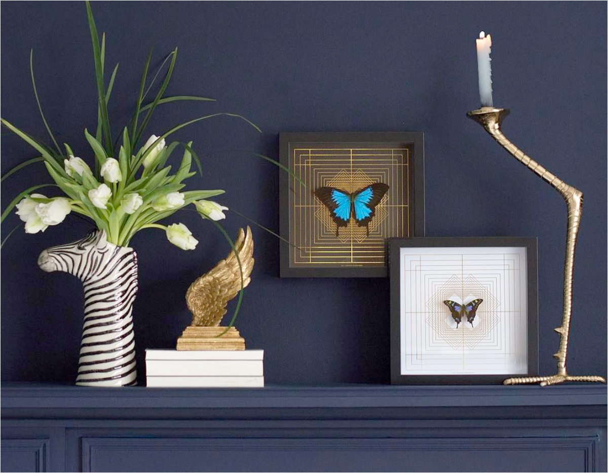
@miafleur_home shared this moody blue, gold, and black vignette from their shop.  I adore seeing walls and trim (on the ledge below) painted the same color.  It doesn't work in every space, but when it works, it's pretty magical.  Speaking of magical, that gold detailing with the butterflies?  Yes please.


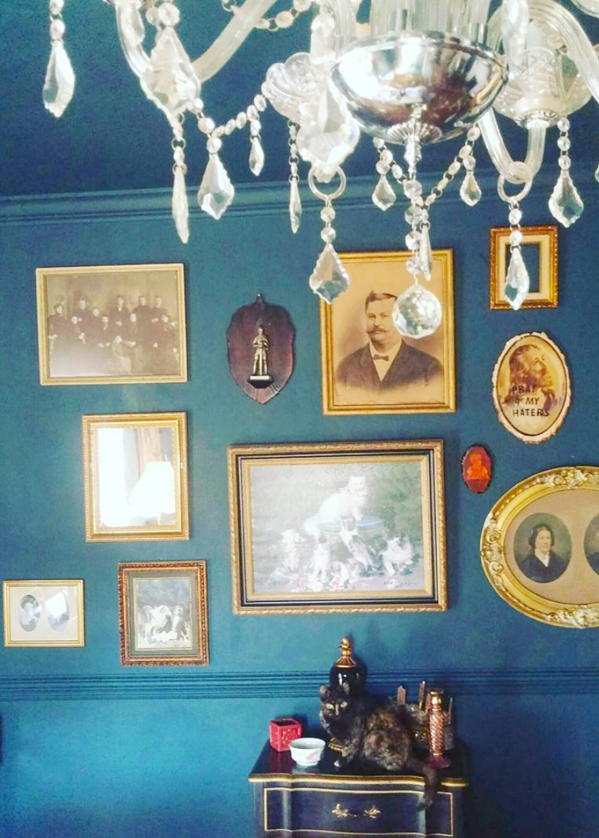
Do you see @sammarietravels new furry friend styling herself on the barcart?  Reminds me of my own Daisy.  Aside from the furry love in the photo, this room is another example showing off walls, trim, and even ceiling in the same color!  That moody blue perfectly sets off the gold frames on all the vintage photos. 


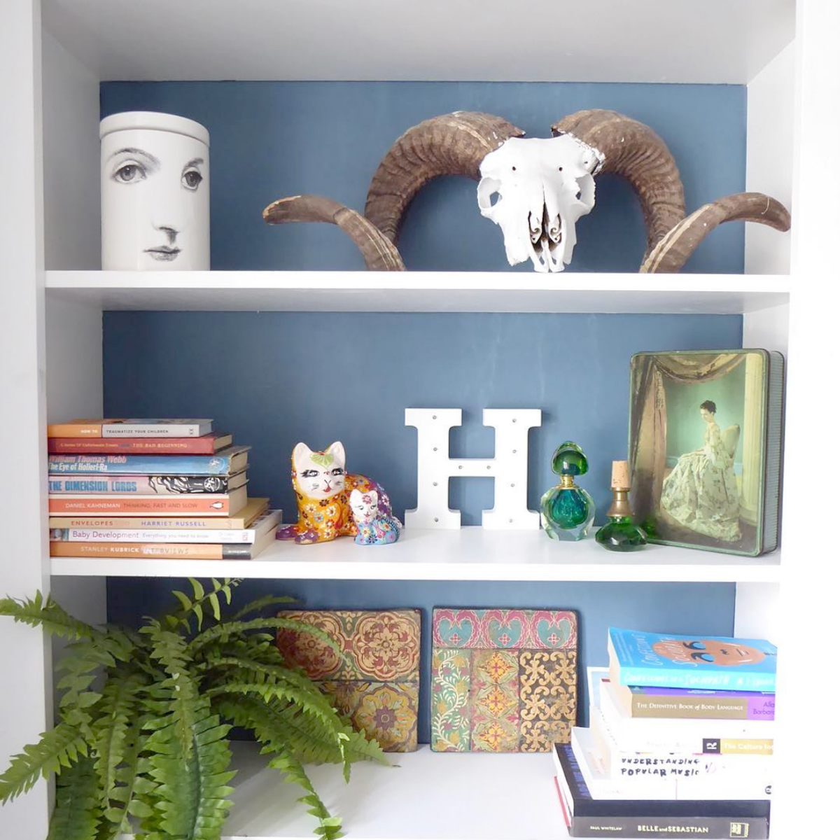
And who doesn't love a good shelfie?  It's almost always a good idea to pop the back of your bookcase with a color like @thenewsaintly did here.  I helps to add contrast and show off your curated goodies!  A pop of color plus a touch of greenery are a MUST on every bookcase in my opinion.


I absolutely loved seeing everyone's #MyBoldHues moments this month!  Keep on tagging your instagram pics and showing off how you live a colorful life!  It doesn't have to be an interiors or vignette shot either- see an amazing sunset? #MyBoldHues.  Painting something special? #MyBoldHues.  Bringing color into your life in any way shape or form? #MyBoldHues.  Keep the hashtags and colorful goodness coming!!!  I can't wait to see what you have to share in the coming month!

Now head over to my awesome #myboldhues co-hosts and see what made them weak in the knees:

PMQ for Two

Style Mutt Home

Semigloss Design

Domicile 37

Jest Cafe Blog

Blue i Style

Save

Save

Save