

I hope you enjoy these weekly updates as I navigate through the business of flipping houses one house at a time!! Come back every Friday to see how this house, aka Shorty, progresses from week to week. To catch up on the progress on Shorty, check out his previous posts here. If you’re new here, (Hello!!!) you can find more about my 5 previous flip houses here. Thanks for coming along for the ride!!
Have you been digging the reveals so far this week? I feel like I've been building up to today's post. If you haven't checked them out yet, before I put the cherry on top with today's reveal, click over to the before and after reveals of the living spaces, bedrooms, bathrooms, and exterior.
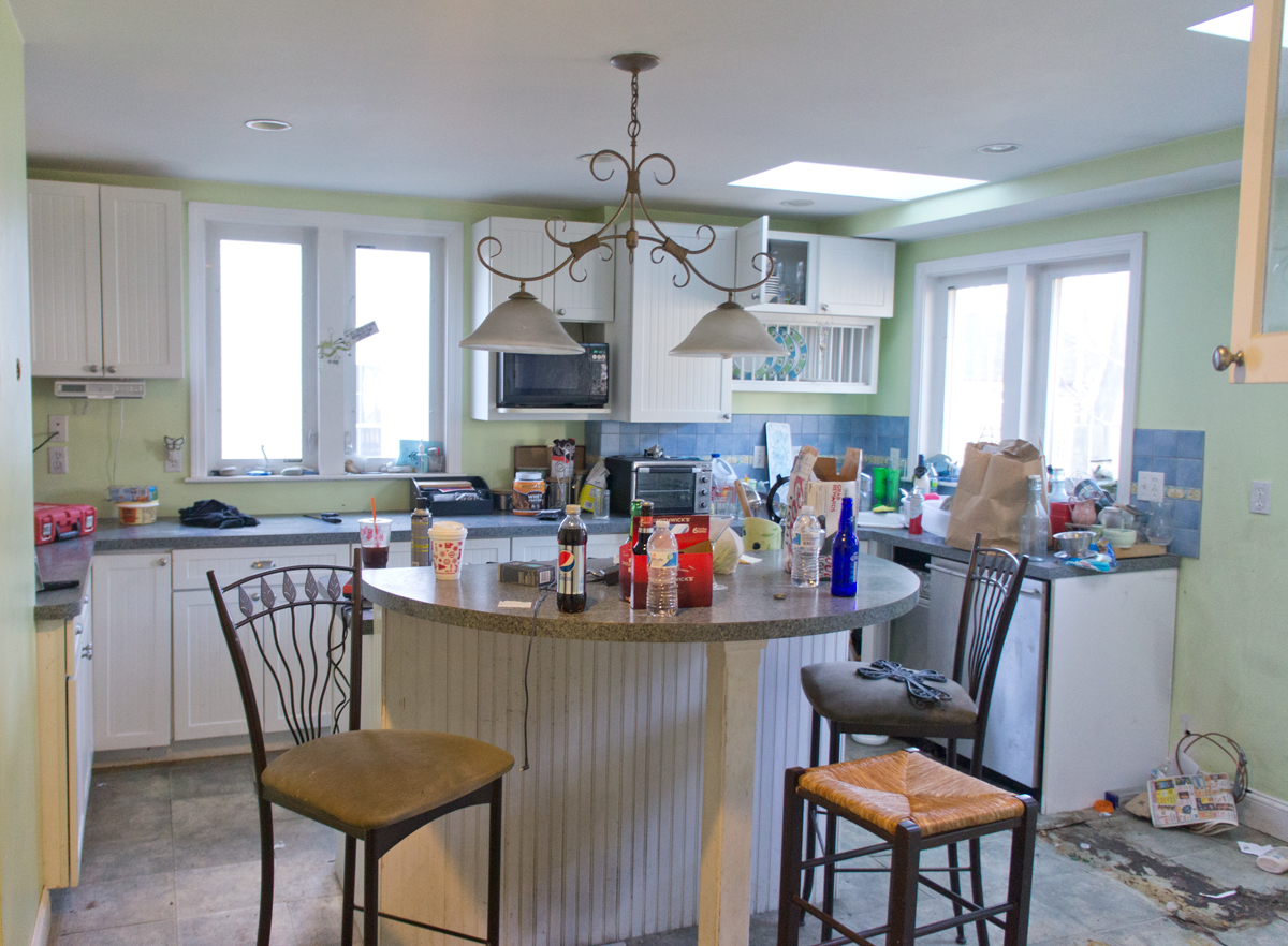
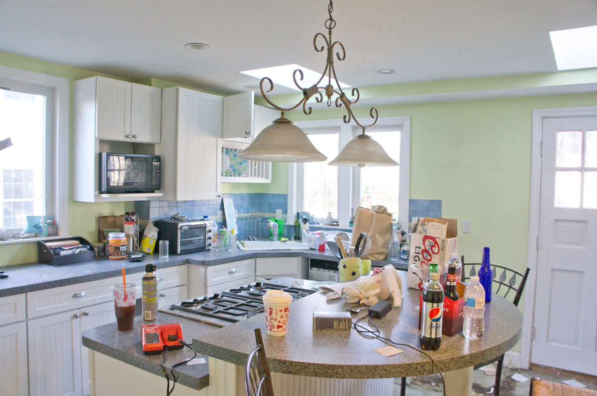
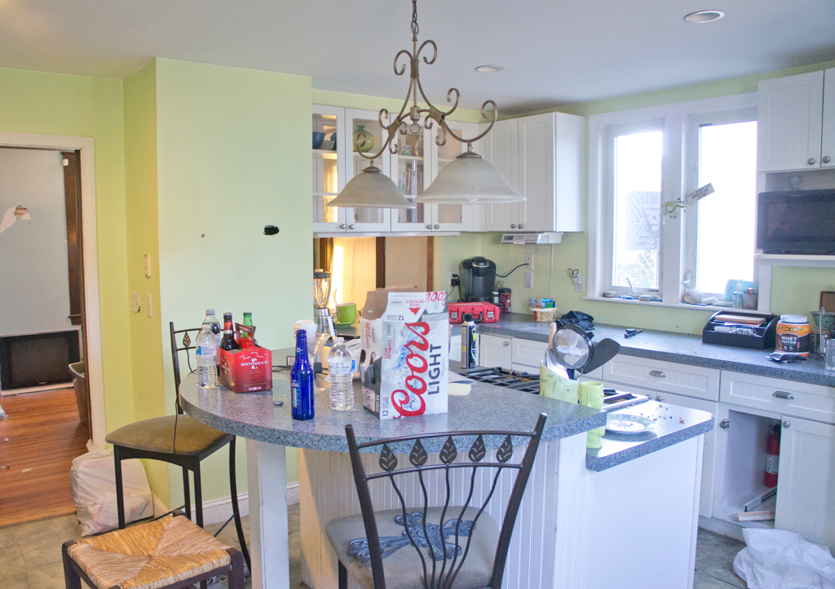
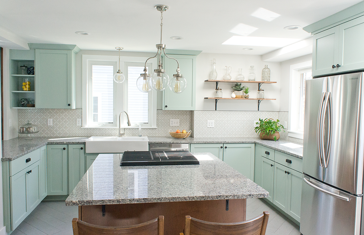
I'm SOOO excited to show you Shorty's kitchen today! The previous kitchen had been a labor of love once upon a time, but aside from years of neglect, it had a few issues that I knew I could fix. First of all, it was too contemporary a kitchen for a vintage home- there were no nods to the architecture of the rest of the house. Second of all, I could see a better layout which would make the kitchen feel even larger. Lastly, functionally, with a sink (in the back right corner), trash compacter, dishwasher, and fridge all squished in next to each other, the space available wasn't properly used.
Seeing those pictures again makes me even giddier to show you what the space looks like now.
Drumroll please....
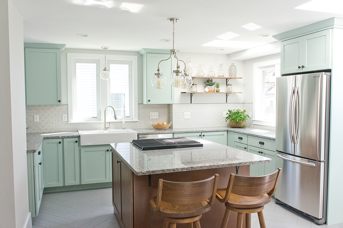
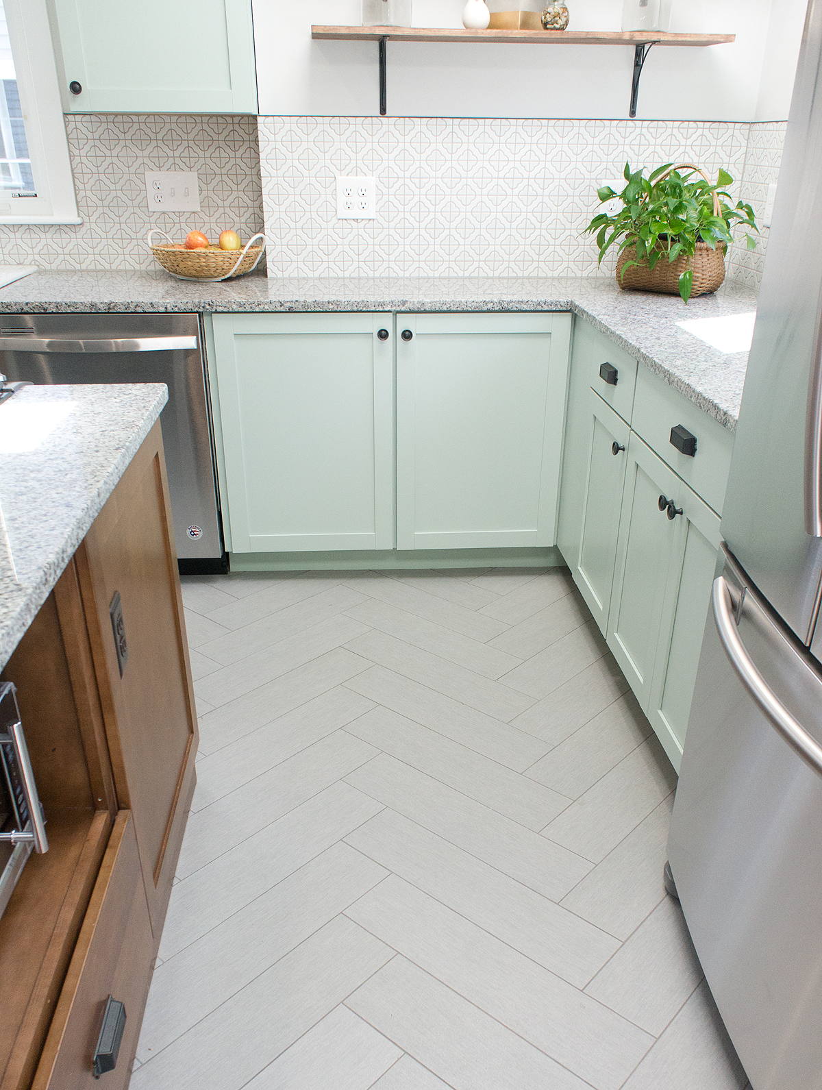
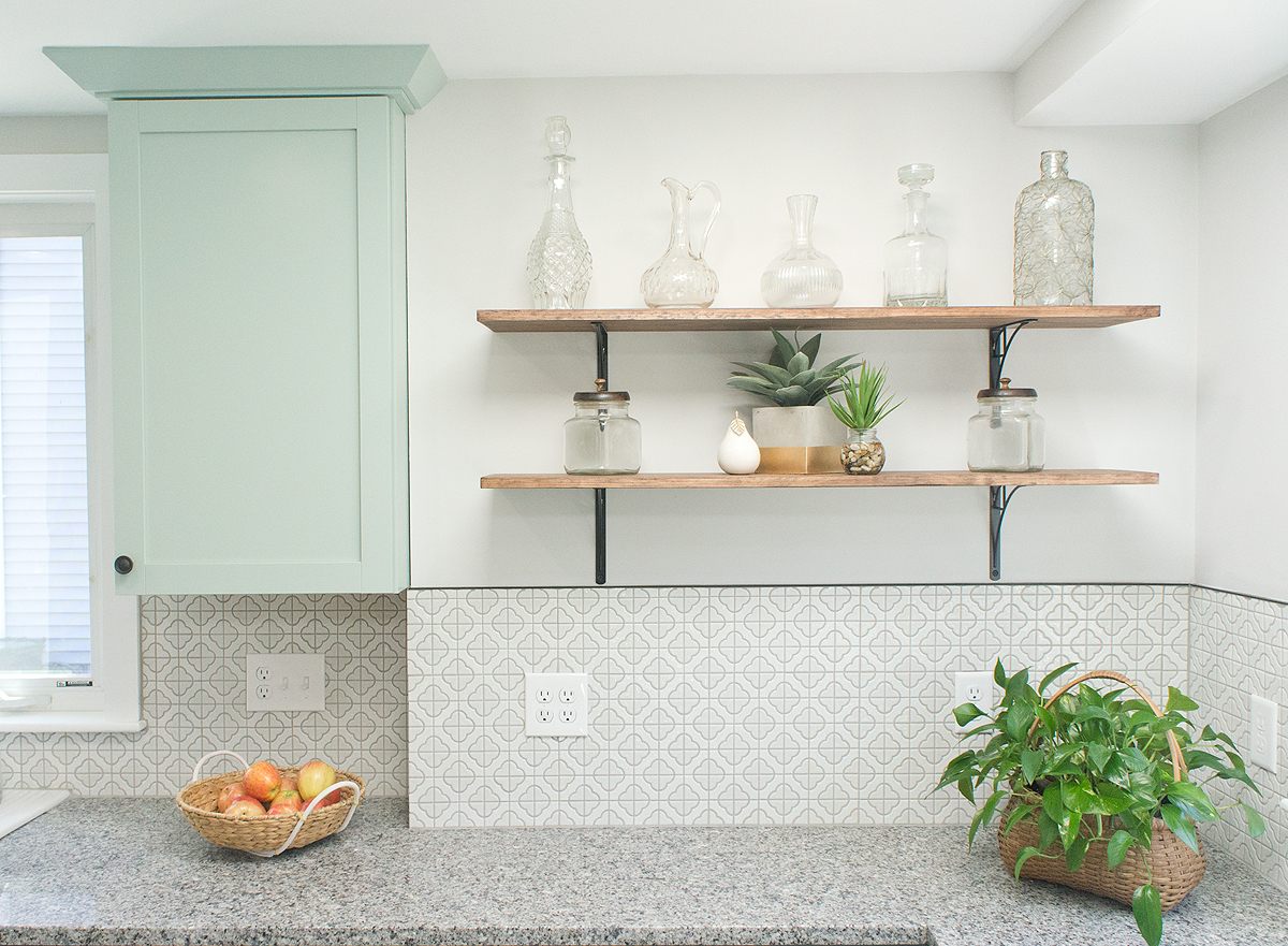
The cabinet space is more strategic which maximizes storage while keeping it as open as possible. There's a proper function "kitchen triangle" with the sink, stove, and fridge near each other but no longer crowding. And can we just talk about how big the room feels now??
I can't take credit for the skylights since they were a part of a previous kitchen renovation, but they do WONDERS to helping the room feel open and bright.

The new sink location was a kitchen game-changer. By moving it out of the corner, the sink becomes a part of the kitchen and someone standing at the sink can look right and see into the dining room, look left and see out to the back yard. No one puts Baby in a corner.
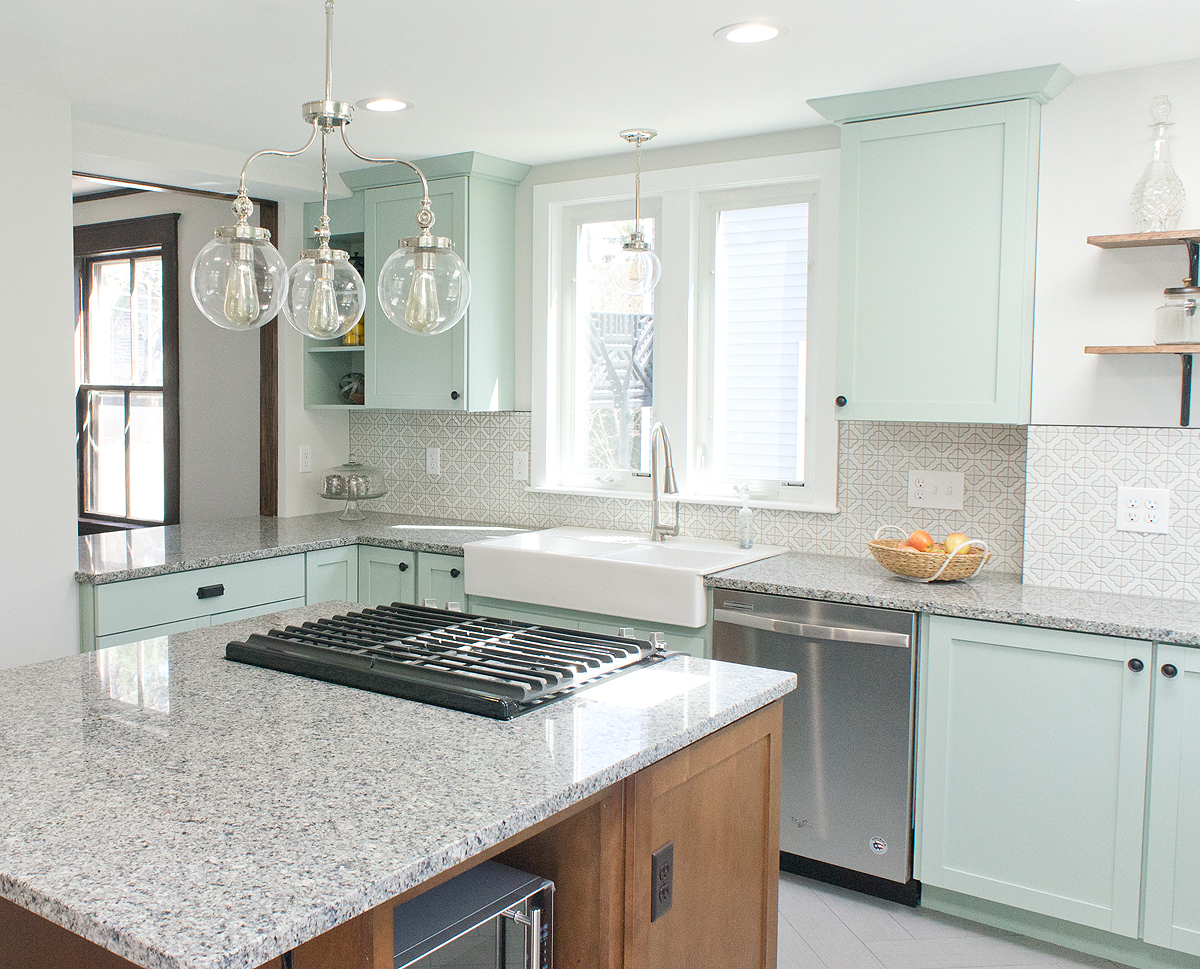
My contractor (and his tile guy) were less than pleased with my tile choices, but sorry not sorry... the floor and backsplash tile rock my world.
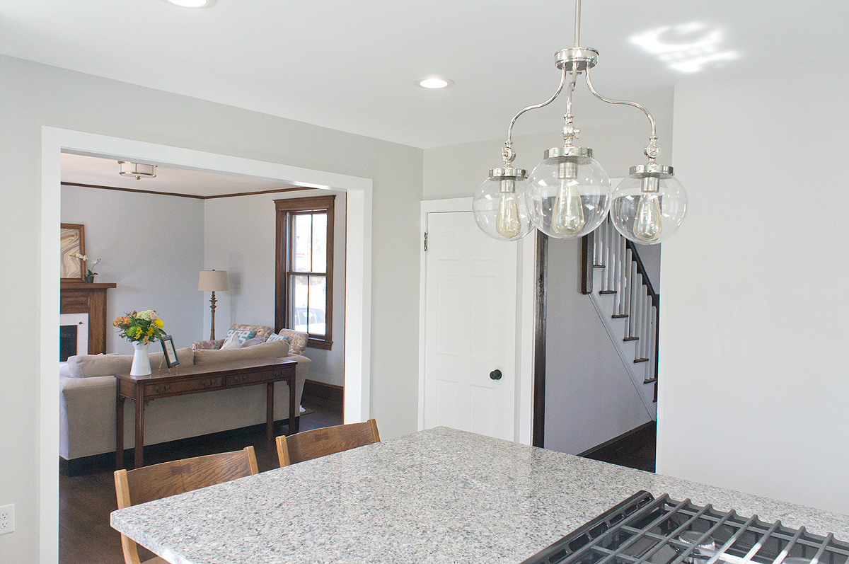
Opening up the wall between the kitchen and living room was totally the right decision as well. What was originally an opening the size of a door got opened to around 6 feet wide and helps to connect the entire first floor. Rooms in antique houses are naturally more segregated due to the way people lived at that time. While so many people love open concept these days, I think what's more successful in houses like these is creating the connection without opening everything up fully.
I know I mentioned it early in the process, but let's talk about WHY I did what I did here. I mean, this is a flip, so shouldn't I have played it safe and done white cabinets? HA. As I always say, you need to give buyers something to fall in love with and in this house, I was banking on the kitchen (and it totally paid off!). Painted cabinets and color were not uncommon in antique kitchens, and having a kitchen this size to play with, I KNEW it could pull it off. I didn't want to shock potential buyers, however, so I kept all the other elements (tile, countertop, etc) neutral with a bit of architectural interest.
Are you as in love with the kitchen as I am?? I'm jealous that I don't have a kitchen like this in my own house... I might actually want to cook if I did! I hope this reveal was well worth the wait!!
Next week, I'll be posting all about paint colors and sources for the whole home so that you can bring in elements to your own space.
Have a stellar weekend!