Inspiration

ORC Rooms to Watch

Are you guys familiar with the One Room Challenge?  If not, you totally should be! Linda at Calling it Home started this biannual phenomenon 5 years ago and it's been getting bigger and bigger ever since.  There are about 20 designers/design bloggers who are part of the official 6 week room transformation challenge, but hundreds of other bloggers join in the challenge on their own.  I've been aware of it the past few rounds and greatly enjoyed seeing the reveals after 6 weeks, but this time around, I'm enjoying all the weekly progress as well!  I would have joined in as an unofficial participant since my dining room could use a bit of love, however the timing didn't work out this time.  So this time, I'll just sit back and enjoy! The participants are just past the make over half-way point and I'm eager to see where everyone takes it!  A few of my favorite bloggers are part of it and I can't wait to see their results!

I am constantly jealous of Nicole Balch's Victorian home.  She always seems to achieve the ideal balance between historical architecture and modern elements, so why should this make-over be any different?  On Making it Lovely, for the One Room Challenge she's taking on her bedroom AND den and *gasp* painting the previously stained woodwork white.  I'm totally on board with the white woodwork- freshen it up while still highlighting the architecture.  I can't wait to see these 2 spaces come alive!!

ORC MakingitLovely QuincyMockup

ORC MakingitLovely SittingRoomPaintColorsMockup


I've got my eyes peeled to see what Gwen at The Makerista can pull our for her basement 'man cave.'

ORC The-Makerista-Mancave-Design-Blue

She's done some pretty spectacular make overs elsewhere in her '80s colonial, so I have no doubt that the final result will make all of our jaws drop.  Just check out her dining room!

The-Makerista-Dining-Room-Black-Walls-Loom-Decor-2


Guys guys guys!  Orlando of Hommemaker is making over a tree house!  Like a real life tree house with a tree in the middle of the space!!

hommemaker treehouse-7

He's going for a cool and kid-friendly space and has shared 4 different design options that he's debating.  I'm voting for option #1, Desert Safari.  Whichever plan he goes with this is going to be one stunning space in the end!

ORC Hommemaker treehouse-design-9

Are you following along with the One Room Challenge?  I'd love to know which make over is your favorite so far!  Tomorrow they'll all be posting about their week 4 progress, so it should be exciting to see how they've progressed!  I just love a good room transformation, don't you??

Designing with... Bold Stripes

Welcome to a new series: "Designing with..."  This series is going to to all about showing you how you can incorporate challenging, bold, or offbeat elements seamlessly into your home. Stripes are such a bold design statement, but it can be a bit tricky incorporating a big stripe into a space without overpowering it.  With bold stripes, the trick is to let the stripe be the star.


On a wall:

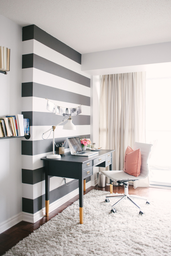
I wouldn't recommend an entire room with bold horizontal stripes for fear of it turning into a carnival attraction, however a single focal wall with bold stripes? You got it!  Choose a wall that is already a natural focal point or is a focal point due to furniture placement: behind a bed, surrounding a fireplace, or in this case, behind a desk.

Style Me Pretty Living: Black and White Office

source: Style Me Pretty Living, Lark & Linen Home Tour


On a floor:

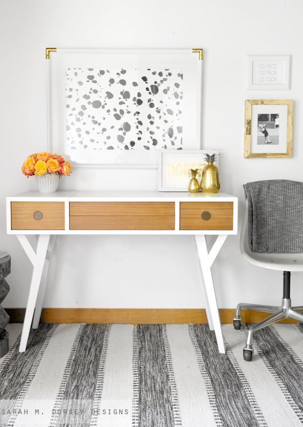
Draw attention to the floor without overwhelming it.  To balance out a pattern-heavy floor, bring the eye up with other interest and pattern in artwork or accessories.  Vary the scale so that nothing competes visually.

Sarah M. Dorsey Designs, MCM Desk

source: Sarah M. Dorsey Designs, Mid Century Modern Vanity | Adding Custom Legs


On furniture:

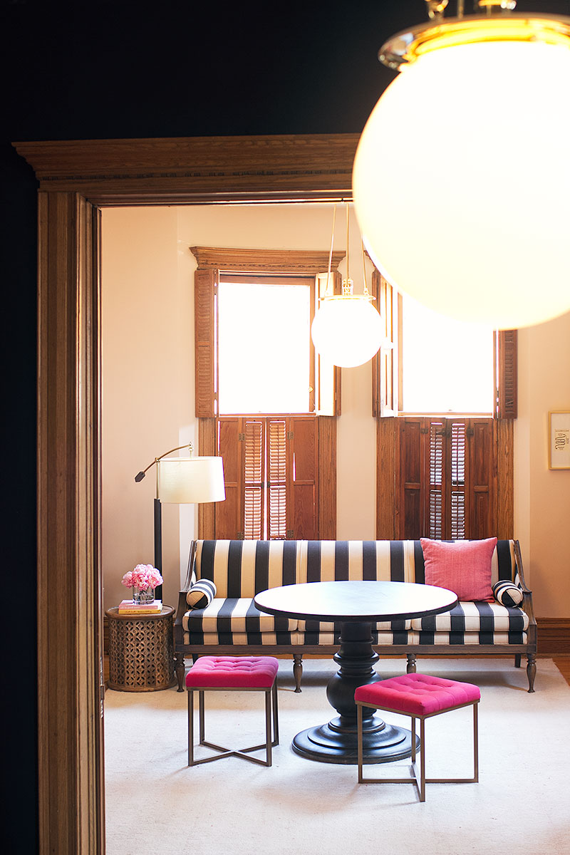
If you're feeling bold, a striped piece of furniture can be such a swoon-worthy element if done right.  Plan for the piece itself to become the focal point and other ancillary pieces should be supporting players.  Use pops of color, smaller patterns, and organic elements to balance out the space.

Making it Lovely: Striped Sofa

source: Making it Lovely, New Lighting in the Library


On a table:

The striking linear quality of a stripe paired with natural elements is a match made in heaven.  Opposites attract for a reason- the organic grouping of flowers softens the harsh lines, while the rigidity of the stripes keeps the flowers from feeling too dainty.

The Knot: Kate Spade Inspired Striped Runner

source: The Knot, A Whimsical Kate Spade-Inspired Wedding in Dallas, Texas


**Design disclaimer** As with all things in design, rules are made to be broken.  These guidelines are just a start, however once your stripe skills have been developed, possibilities are endless!


Future "Designing with..." posts will include polka dots, brass, and florals to name a few.  I'd love to hear what design topics you're stumped by and would love to see in this series (or in a separate post if applicable)!

Shop the Look: Statement Art

This post is brought to you by Photos.com by Getty images.  I promise, however, that the opinions and content are all my own. There are few things that can make an impact like statement art can.  A growing trend these past couple years is over-sized photo art, and ya know what? I'm totally on board with this trend!

OLD+BRAND+NEW+•+KAITLIN+MCHUGH

Photo: Kaitlin McHugh's gorgeous home as shared on Old Brand New

To shop the look above, I decided to get specific and look for stone formations by the ocean like the photo in the space- something a little moody.  Luckily for me, Photos.com has a whole category of Seaside>Rocky Beaches.  I was pleasantly surprised with the options!

Photos.com by Getty Images

Photos: 1/2/3/4

My personal favorite to capture the feel of the statement art above would definitely be this one, however.  Bold and brooding with a touch of color.

Photos.com by Getty Images

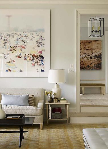
The next room I wanted to see about emulating is this elegant living room by Steven Gambrel as featured on Housebeautiful.com.  Same oversized photo trend as the first room, but a very different vibe.

house beautiful oversized art

This time I'm torn between 2 great options:

Photos.com by Getty Images

Photos.com by Getty Images

Both options would be amazing in the space- the backgrounds keep the overall print pretty neutral, but the small pops of color from the beach-goers add a playful tone.  Not too serious, not too funky- just the right note.

As I poked around Photos.com a bit more, I stumbled on this ridiculously fun print that I'm just itching to put in a room now.  How awesome would this dalmatian be as the focal point of a play room?  Printed on acrylic and mounted to the wall on metal stand-offs?  Hello!  The grayscale palette would keep it from looking to busy with the inevitable rainbow of childrens toys strewn about the room.

Photos.com by Getty Images

Thanks, Photos.com for bringing you today's post and all the statement art inspiration!

What's your favorite way to use photography in your home?